

A Global Refresh for an Iconic Legacy Brand.
MTV REFRESH
Branding, Design Direction
For the first global redesign in MTV’s history, our goal was to create a simple and flexible system that re introduced visual cues of the legacy brand while prioritizing user experience across all spaces.
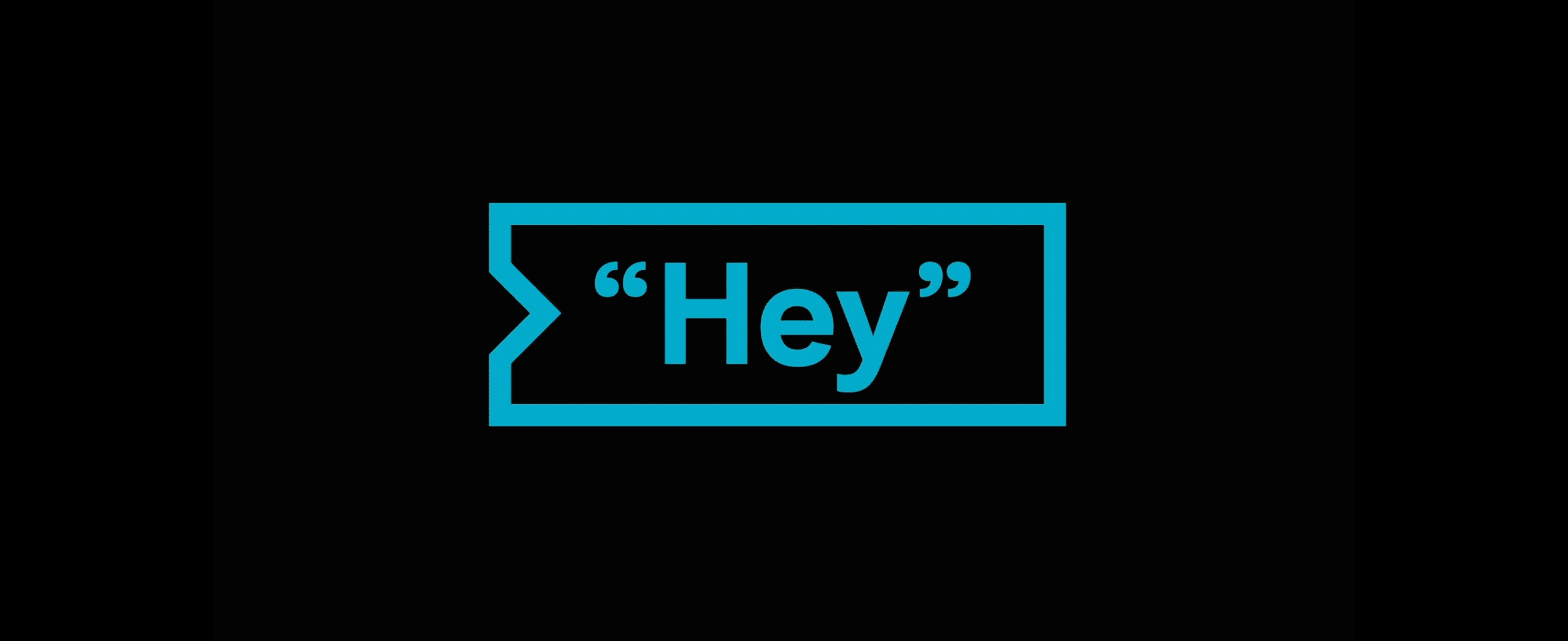
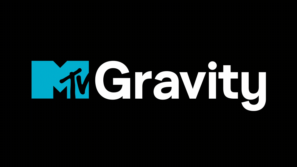
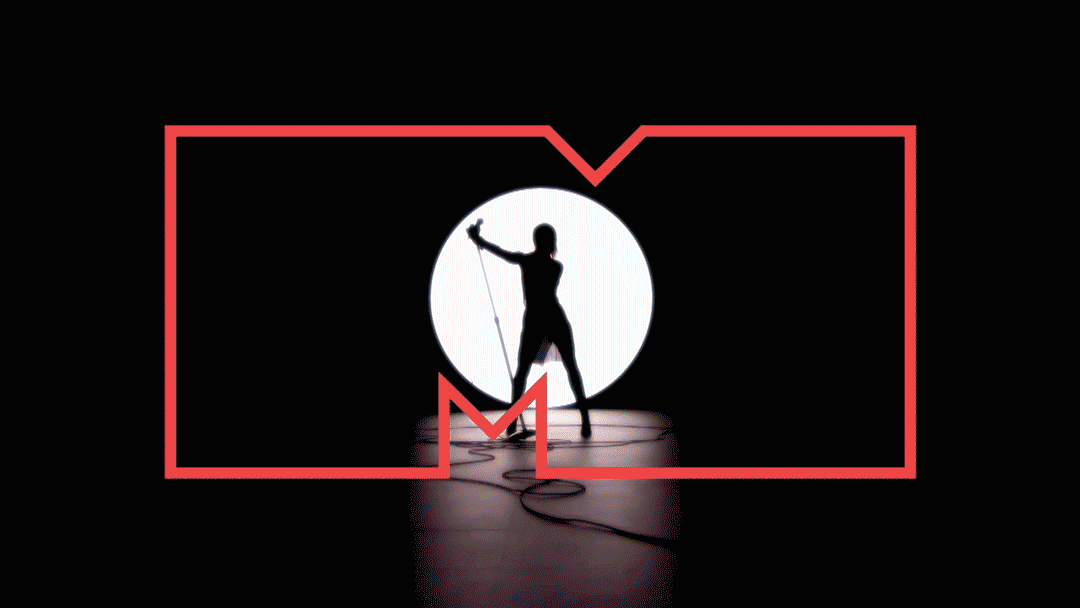
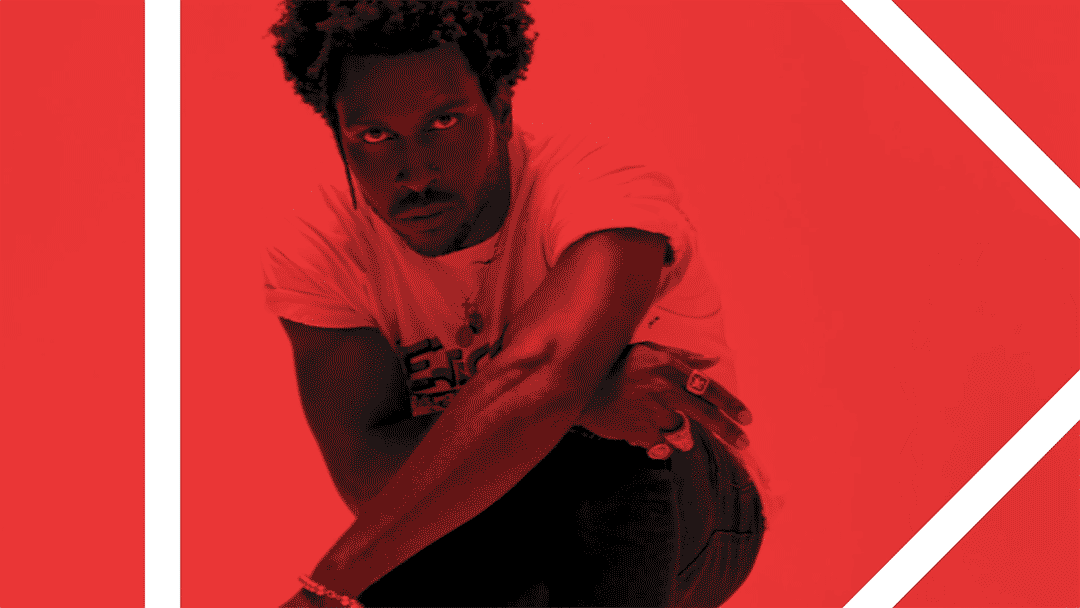
Consumer insights revealed that the classic 3 color mtv logo drove highest affinity and brand recall. So in an age of reblands, we embraced a multicolored hero logo, with a few mods of course. In addition to the refined tri color logo, we created the mtv gravity font and a series of patterns that gave homage to the first mtv moon landing ID.
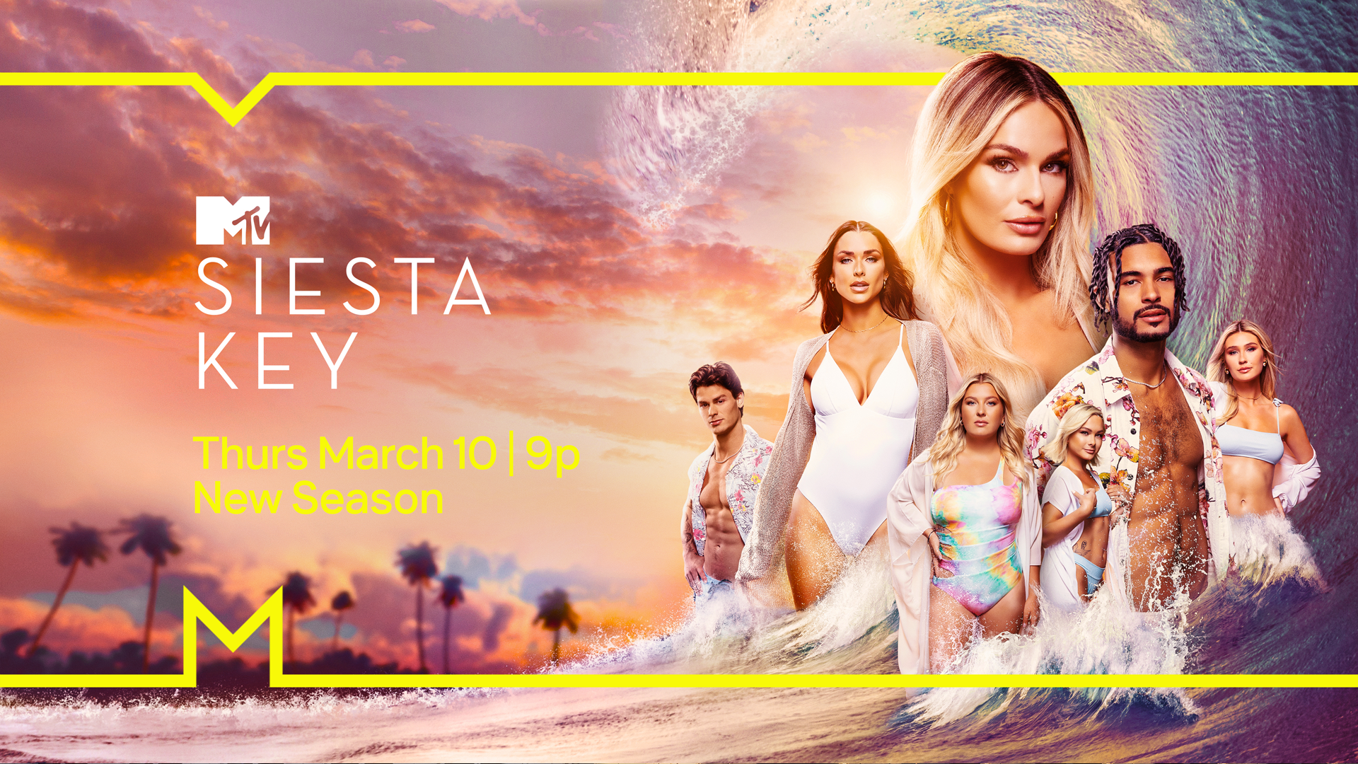
The system also leverages the M in a new way, allowing us to showcase and frame content – without getting in the way of the stories, strengthening brand equity and brand attribution.
The rebrand was launched in August of 2021, 40 years after the first broadcast of mtv, across all touchpoints of the mtv brand, around the world.
Created in partnership with Loyal Kaspar.
BRAND ELEMENTS
KEY ART


DIGITAL


SUB BRANDS
-
BRAND CREATIVE TEAM
SVP Design: Thomas Berger
SVP Editorial: Justin Russell
SVP Creative Strategy: Lauren Epstein
VP Design: Rich Browd
VP Motion Design: Timothy Livezey
VP Digital Design: Rich Tu
VP Design Production: Pam Brill
Sr. Creative Director: Lance Rusoff
Sr. Director, Design Production: Ross Jeffcoat
Creative Director Social / Digital: Gavin Alaoen
Sr Dir, Creative Ops & Strat: Christine Visel
Manager, Creative Ops & Strategy: Tara Marin
AGENCY PARTNERS
LOYAL KASPAR